

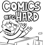
Perfect!By Ence on April 12th, 2010
When you come to Massive Pwnage, you want to read the comic (hopefully), so it should be the first thing you see. Before, it was surrounded by banner ads, making things feel crowded. Does it look better now, you think? It took me several hours messing with HTML to make it look exactly how I wanted, so it better. |
|
|
|


Well, on IE and Firefox it’s better, but the last quarter of the strip is cut off on Chrome. 🙁
Really? ARRGGHH
Well, I just downloaded Chrome and so far everything looks okay… Anybody else seeing any problems??
ni it looks much better in my opinion. you notice the comic more and the ads seem out of the way now
One of the ads is horizontal too, makes it really weird and elongated.
The banner ad that’s all the way at the top, just below the logo? Is it showing up wrong somehow? I’m always paranoid about this stuff, haha.